Luxe Magazine: December 2019
Neutrals Let The Artwork Do The Talking In A Memphis Home Made For Gatherings
Written by Christine Deorio | Photography Rett Peek | View Article
When asked to share her favorite things about her family’s newly redesigned Memphis residence, homeowner Catherine Nelson doesn’t respond with details about channel-tufted headboards or statement chandeliers. Instead, she shares stories of the gatherings she and her family have hosted here: a bridal luncheon for 100, Bible-study groups, game-day parties, the list goes on. “We’ve always been joyful people because our happiness isn’t rooted in the things that we have,” Catherine says. “But with that said, I don’t know that we always looked forward to going home.”
Since 2005, home for the Nelsons–Catherine, her husband, Patrick, their four children and a beloved golden retriever–has been a 1975 brick two-story abode in the suburban neighborhood of Kirby Woods. The Nelsons are its second owners; preceding them were die-hard football fans who filled the house with their favorite team’s colors. “It was orange carpeting, orange everything,” Catherine recalls. Dark wood paneling and a dearth of lighting created a vibe completely at odds with the couple’s preference for clean lines, neutral colors and abundant natural light.
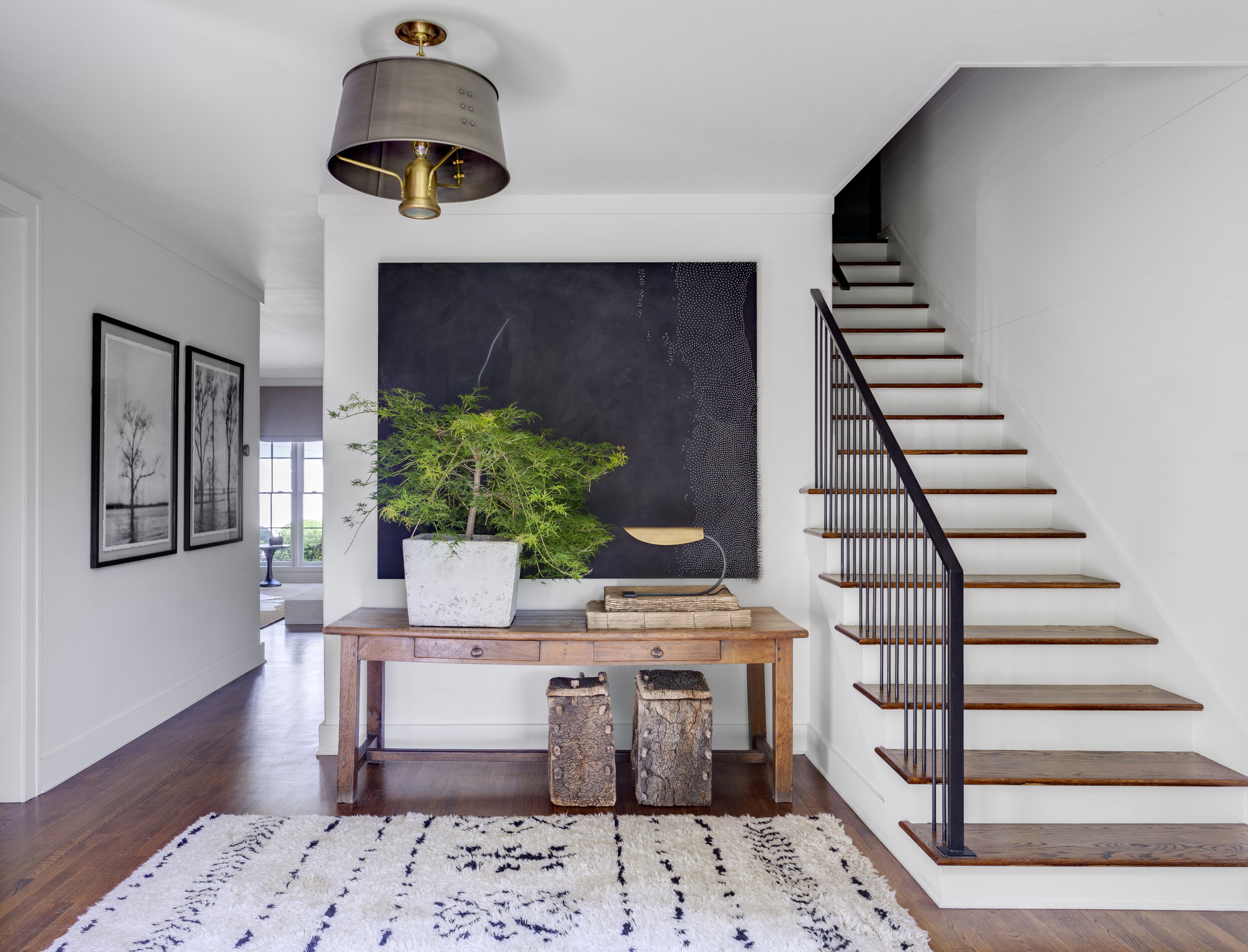
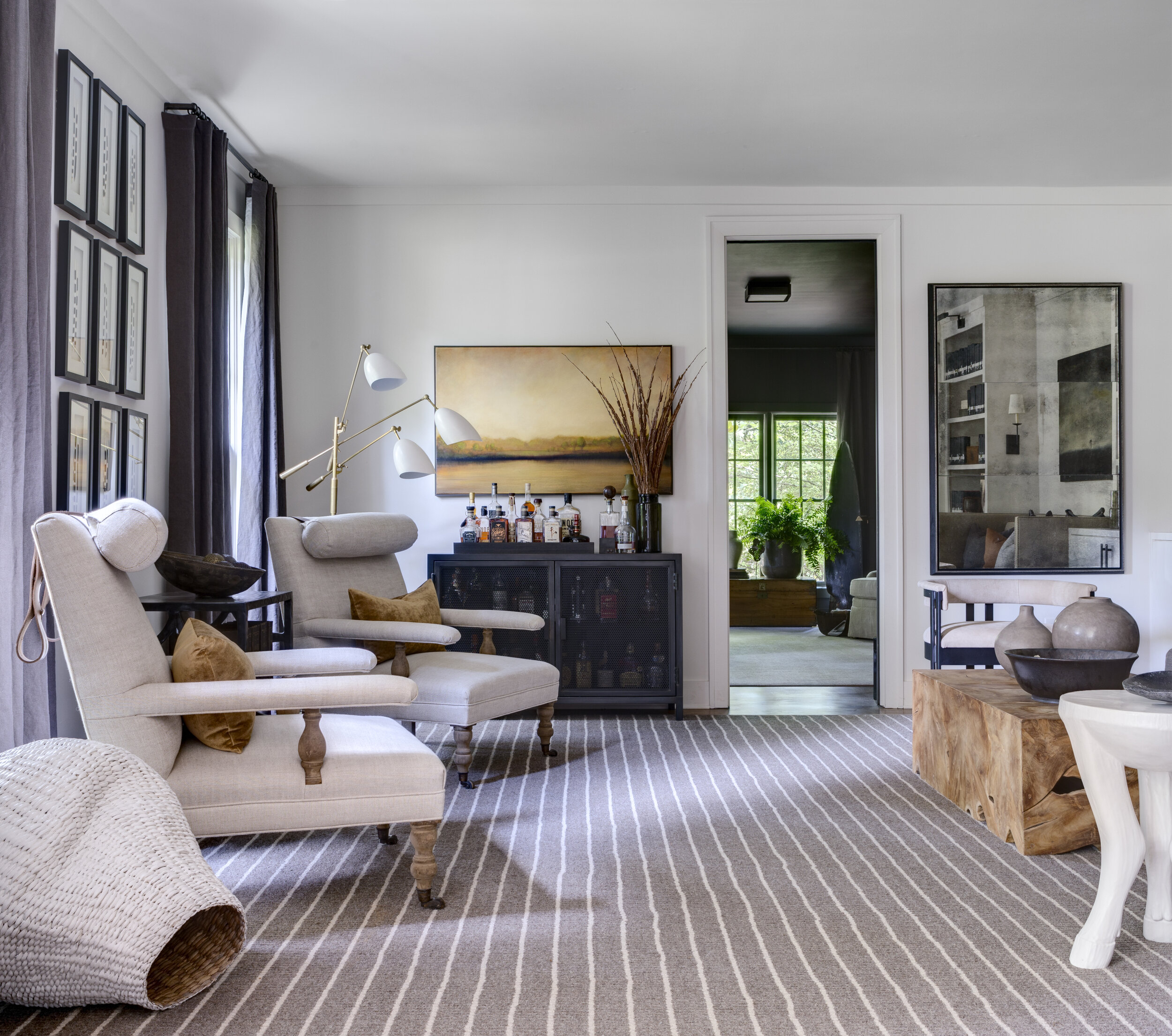
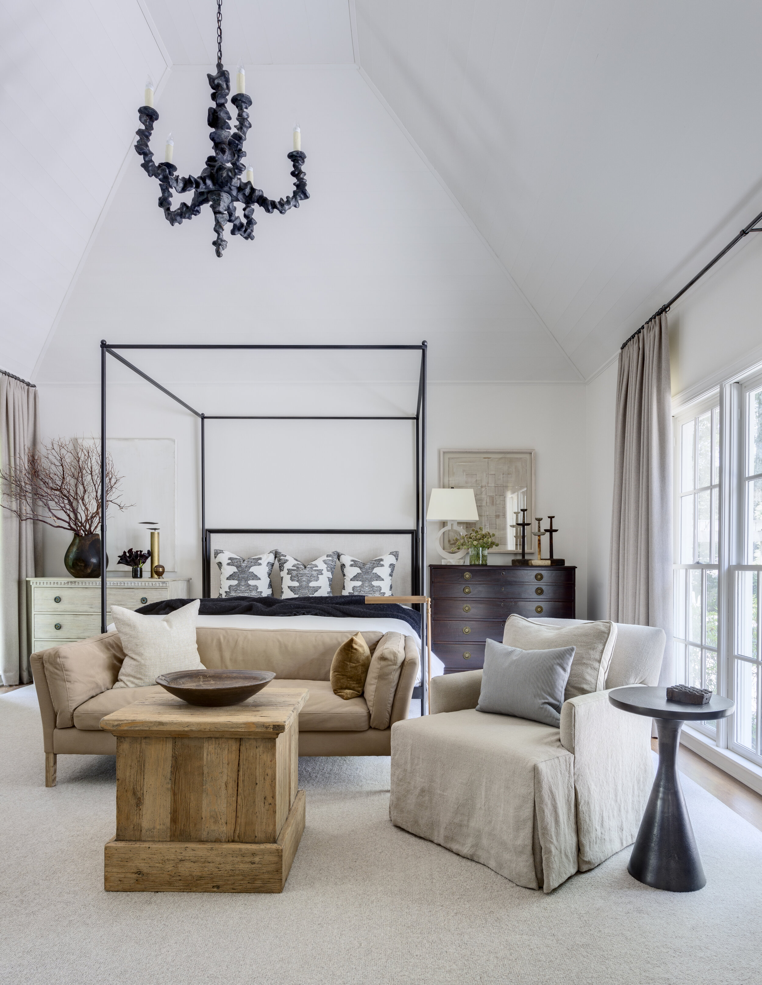
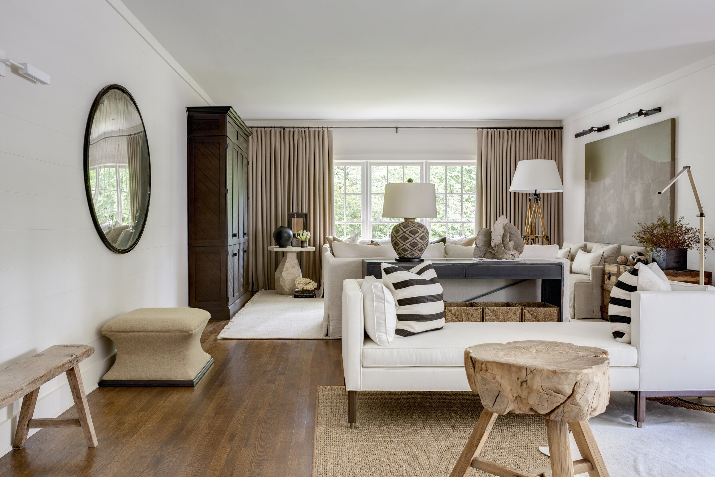

It was evident a top-to-bottom renovation was imminent, but it would be more than a decade before the Nelsons felt the timing was right. Meeting designer Sean Anderson through a friend of a friend was what finally set the remodel in motion. “Sean listens very well and leads well,” affirms Catherine, who looked to the designer to direct every part of her home’s overhaul, from the structural to the decorative. “As soon as I told him we were looking to lighten things up, Sean immediately suggested painting the rooms white and bringing in more lighting. He also understood that we wanted a very neutral palette–so people would be drawn to the artwork more than the furniture.”
That artwork includes many local talents (“We love our city, and we told Sean it was important that much of the art be by Memphis artists,” says Catherine), as well as creatives throughout the Southeast, who Sean Anderson commissioned specifically for the project. Among them: a dark, nail-studded canvas by Atlanta’s Ashley Finnemore in the foyer; a plaster piece by Birmingham, Alabama artist McKenzie Dove in a guest bedroom; and an acrylic-encased brass sculpture by Nashville’s James Worsham in Patrick’s office. “It’s made of 42 tiny ‘paper’ airplanes–a nod to his passion for flying,” explains the designer, an occasional artist, who himself contributed a couple of pieces. “This is what my work is about. Telling those stories through art and objects.”
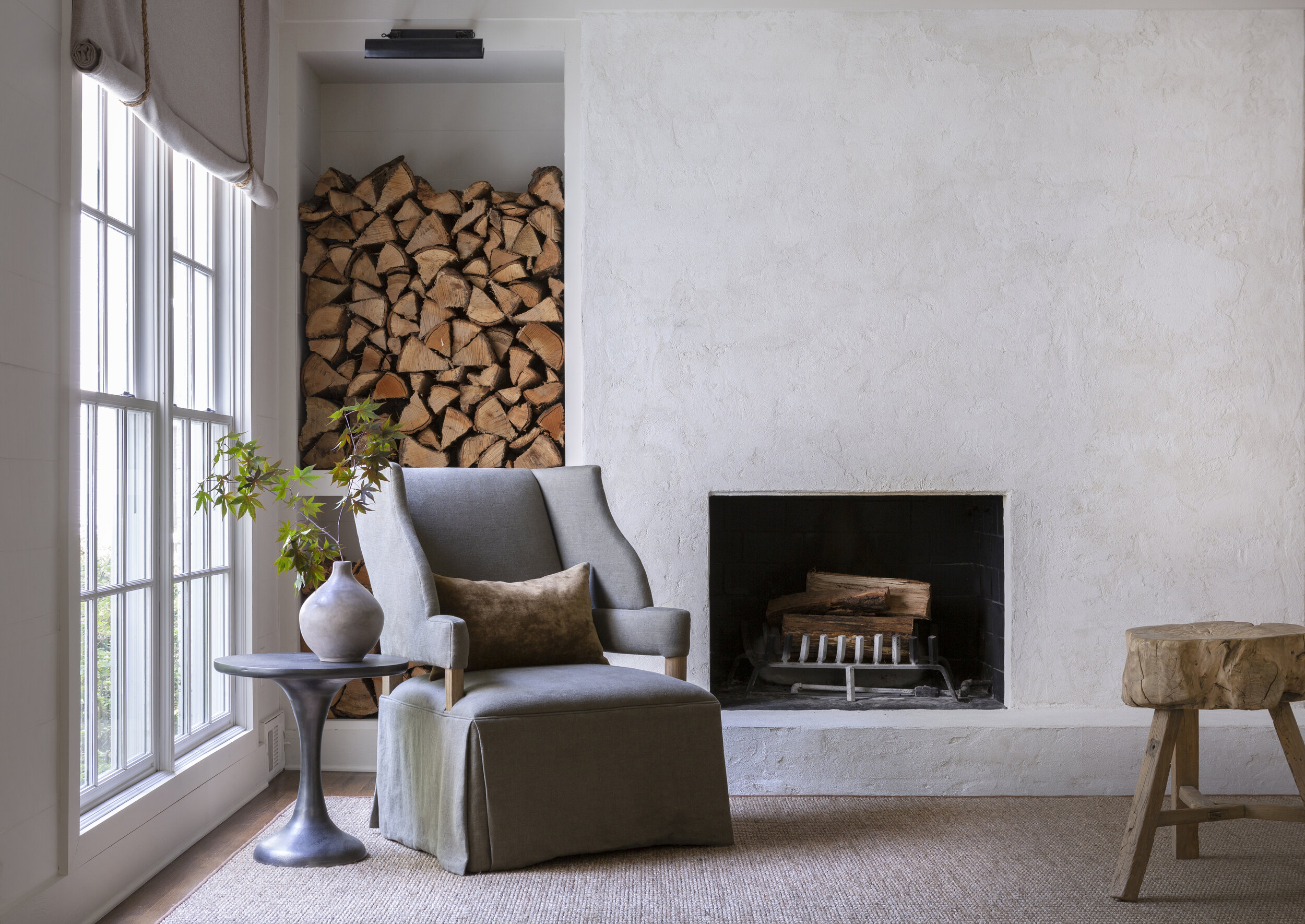
To give the pieces in their collection greater impact, the designer painted most rooms the palest of grays–virtually white–for a cohesive look that “opened things up and created continuity among the spaces.” To modernize the home’s major anchor points, fireplaces were enhanced with sleek applications of plaster, and the kitchen–the one room the homeowners had previously revised–was updated with new hardware, fresh paint on the cabinets and honed white marble countertops.
“I wanted a more organic feel,” Sean Anderson says of his decision to keep the gathering spaces neutral, combining contrasting textures–a shaggy wool rug, Belgian linen, matte-painted book spines, an ivory cowhide–with objects that stoke curiosity. “For every new object I added, I tried to find an older one to counterbalance it,” explains the designer, pointing to finds like petrified-wood tables, a vintage ladder and a time-worn shovel mounted to a fireplace wall.
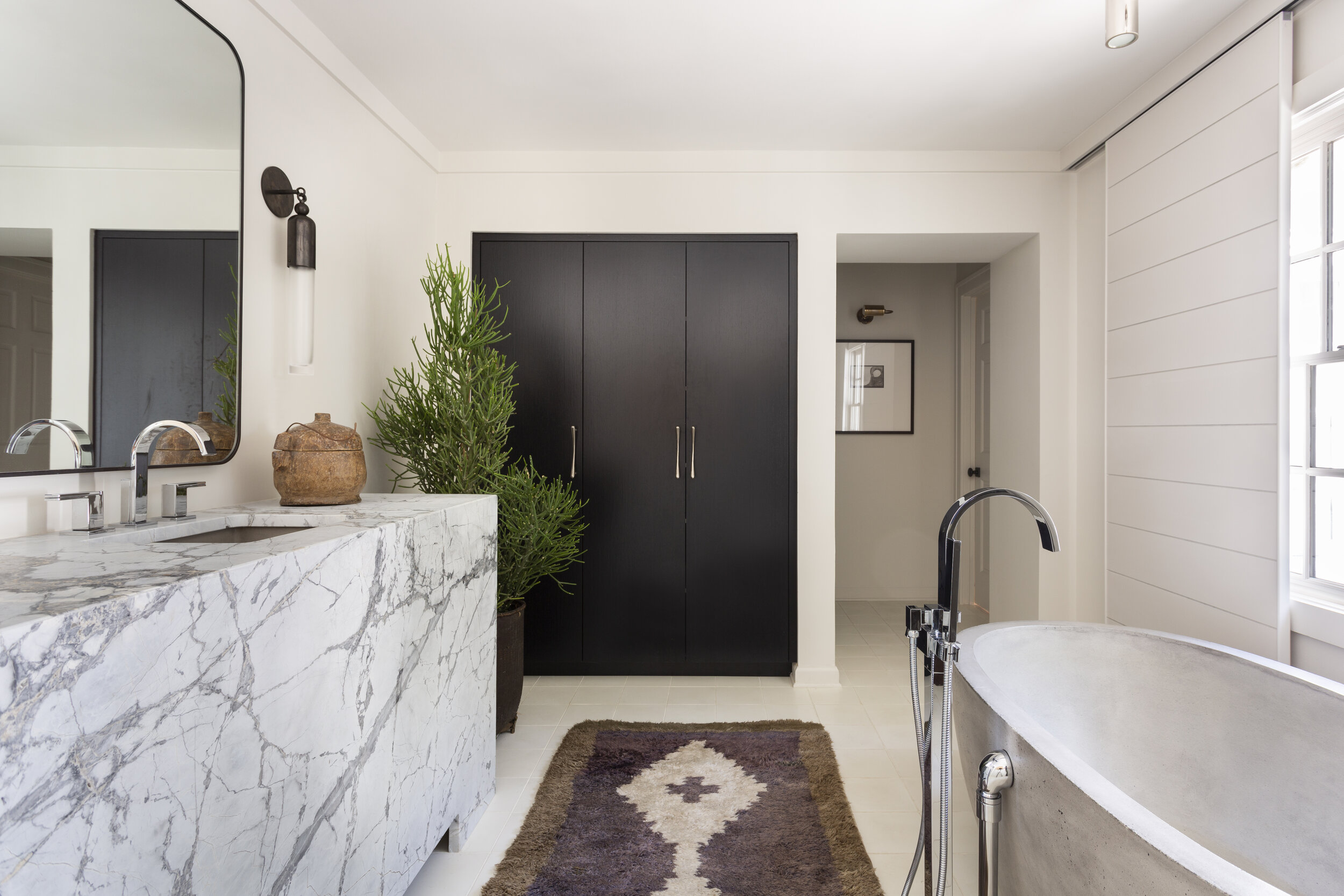
Joining later in the project, architect David Anderson likewise looked to the past when converting three upstairs bedrooms and one shared bathroom into a pair of spacious suites–a delicate operation that builder Dale Menkel managed to execute without disrupting any of Sean Anderson’s achievements on the first floor. “I used classical architecture and traditional forms to drive our decisions for proportions and layout,” the architect explains, “but because we weren’t trying to restore the house to a particular period, we were able to transform the interior into something a little bit different.” That creative approach extended to the designer’s efforts upstairs, including a bathroom with a freestanding concrete tub, a massive quartz vanity and floor-to-ceiling shutters–designed in concert with David Anderson–that provide instant privacy by gliding along a recessed track.
The house may tell many stories about its owners, but it never takes the narrative too seriously. And neither do the Nelsons with their approach to living in it–focused more on collecting memories than belongings. “We walk in and we just feel happy. There’s a real sense of peace when you come into our house. It’s all just inviting and comfortable and handsome,” Catherine says. “I don’t think we ever felt this way about our home before.”

