Elle Decor: May 2017
A Country Home Plays with Gothic Decor
Written by Lacy Morris | Photography Alyssa Rosenheck | View Article
When it came time for interior designer Sean Anderson to tackle his own home, he took his signature color palette head on.
“I don’t know why I’m drawn to dead things,” muses interior designer Sean Anderson while reflecting on the East Memphis home he shares with his partner, and their dogs, Bentley, Watson, and Cooper. “I’m attracted to darkness; I like the mystery and masculinity that comes with the palette," he says, admiring the sexiness unrivaled with other colorways.
Anderson likes dark hues so much, in fact, that when the couple abandoned Memphis proper and found their “forever home” on five wooded acres surrounded by horse farms, Anderson had the whole thing washed black, inside and outside.
Perhaps, he recalls, “it’s something picked up from my childhood in rural Mississippi. I spent most of my time outdoors, treasure hunting and building forts. And to this day, nature is one of my biggest inspirations.”
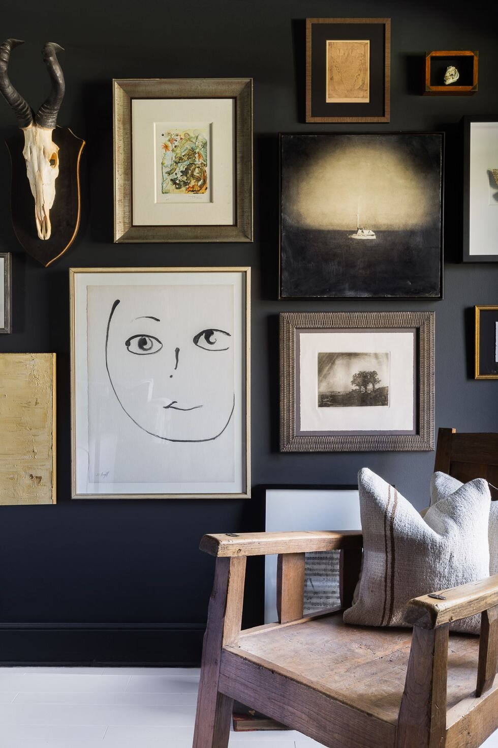
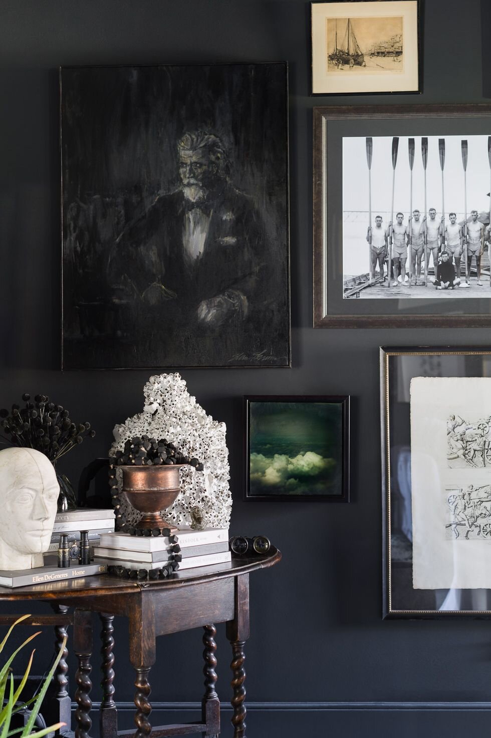
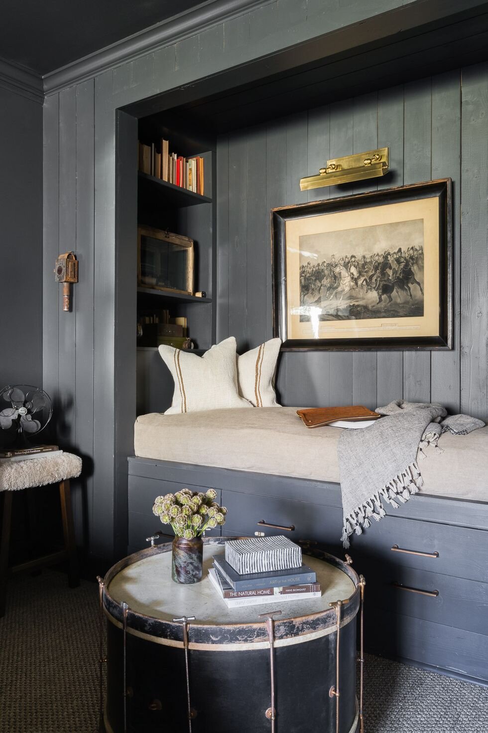
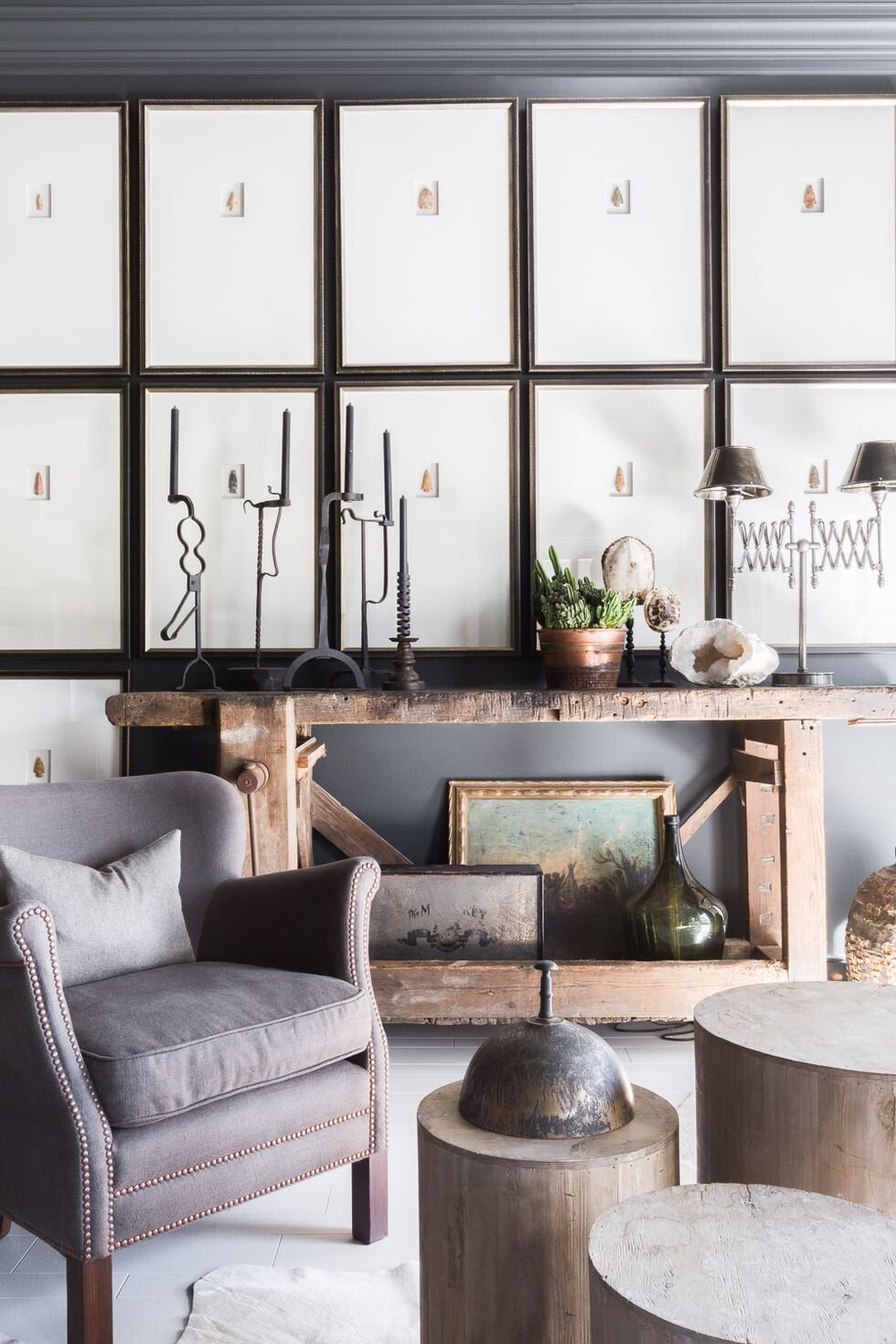
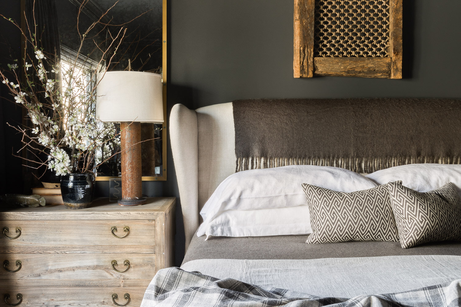
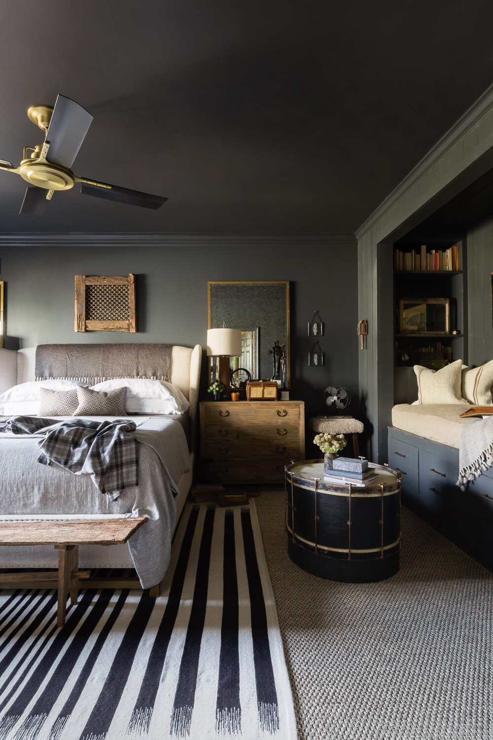
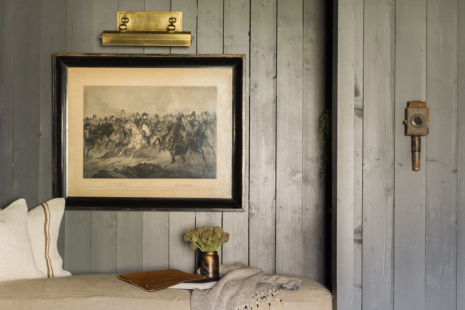
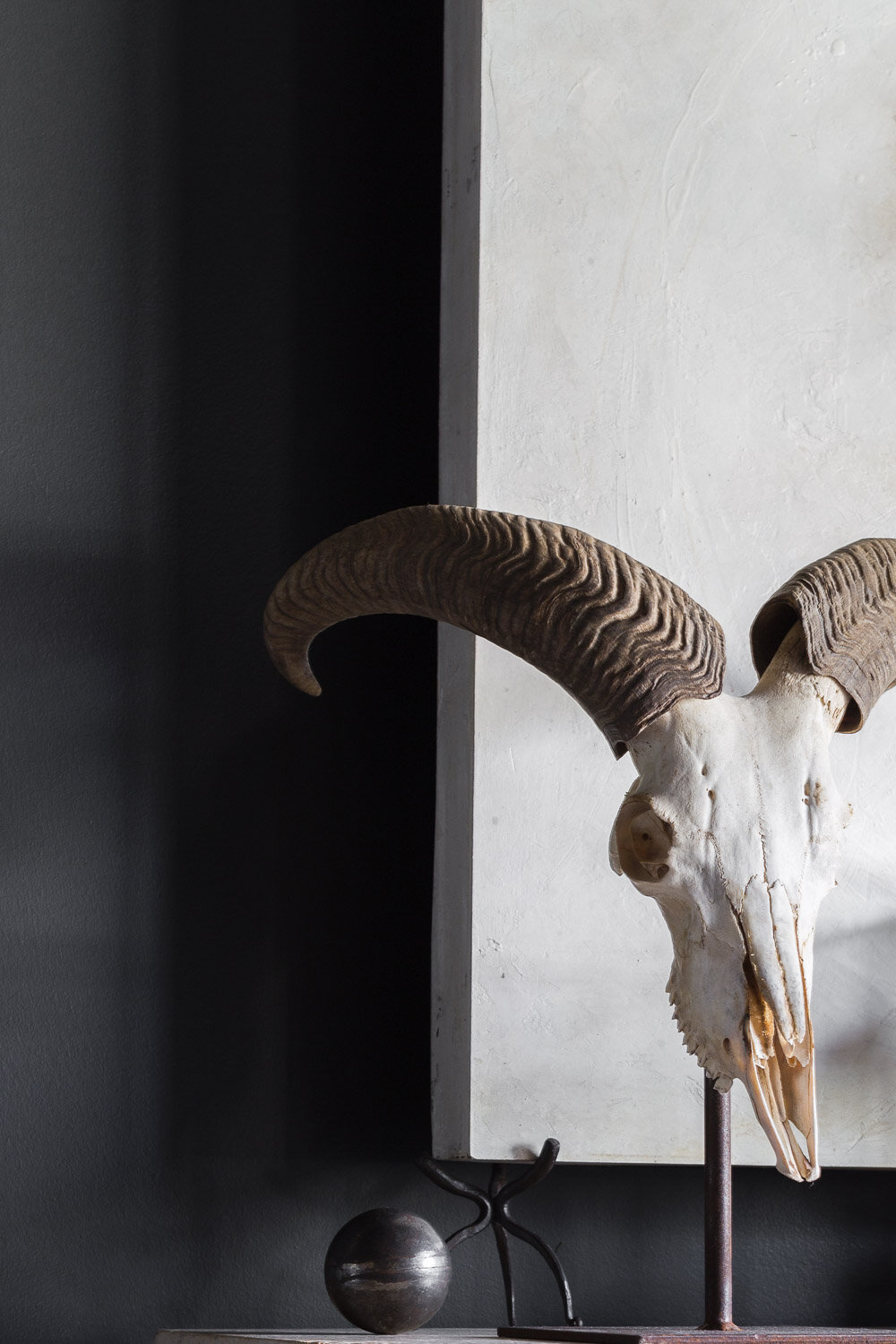
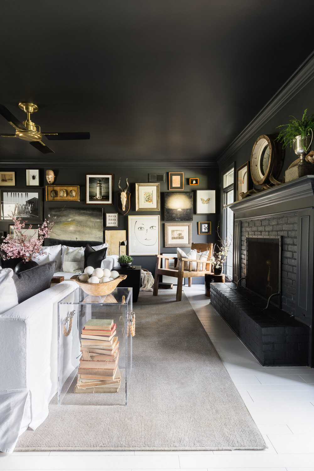
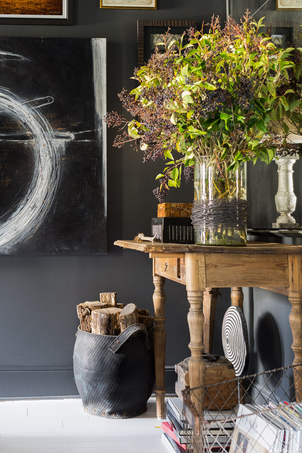
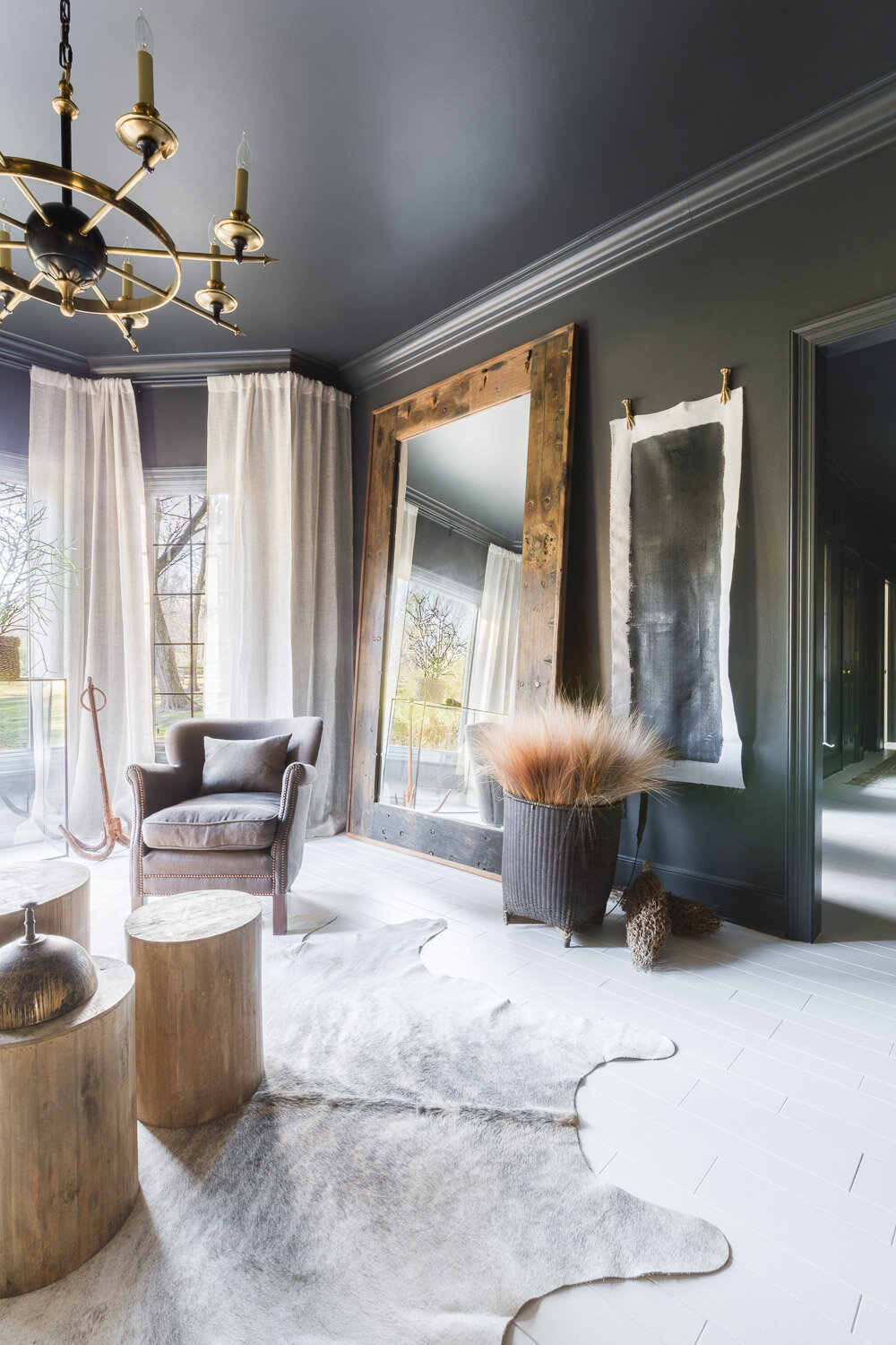
The bug collections, the animal horns, and the rough-hewn woods thoughtfully placed throughout the four-bedroom, four-bathroom home are all design choices drawn from childhood memories, a youth spent roaming around the same land that his grandfather once farmed.
The house, which Anderson estimates was built sometime in the late '80s, has three pitched gable roofs, typical of a Tudor-style home, but black brings out a more contemporary aesthetic while shutters add warmth.
It’s a work in progress, Anderson explains, and they’re currently consulting with an architect on ways they can rework the footprint to achieve their end goal, “a modern farmhouse.”
The interiors were always charming, enough so that the pair lived in the home as it was when they first received the key and took the time to notice how the spaces would end up being used before Anderson made any changes. “Your home tells your story; it's a genuine representation of you, or should be,” he notes. When working with his clients, there’s a different sort of balance, but when it came to outfitting his own space, Anderson wanted to create an environment that would immediately convey who he was at his core to a stranger walking in.
The chief way of suggesting Anderson’s character came by way of a paintbrush. “I’ve always loved black rooms,” he explains, so every last wall, save a guestroom, was designed in a timeless, brooding shade of gray.
To add depth, the floors were white-washed, an element that Anderson says actually makes the house feel brighter. “It’s funny because I’ve always been a less is more guy,” but with the color palette and the decision to dig out an attic-full of items he’d been collecting and stashing away, “this is now a more is more house,” he quips.
And so those items found new homes within Anderson’s home, a collection that’s eclectic and personal, and to some, a tad intimidating. In the master bedroom, prominently displayed at the foot of the bed, is a ram skull, its eye sockets, gnarly jaw, and arched horns nothing if not a study in texture. “It's one of those pieces that’s constantly moving from place to place, mostly because my oft-visiting three-year-old nephew stresses how much it ‘freaks him out,’” jokes Anderson. “But I respect history and I love the idea of taking something old and giving it a new life in an entirely different way.”
Those “what’s old is new again” moments are seen in every nook and cranny, tucked in amongst fresh objects that are living their first iteration, because “the juxtaposition of opposites is what truly fuels my designs,” Anderson affirms. “It’s about combining contrasting themes and discovering the harmony of them once paired together.”
In the living room, the coffee table is a well-worn trap door he had a base built for, and above it, amongst 20-some other thought-provoking pieces, a framed black-and-white portrait of a 1940s rowing team, which Anderson holds no relation to, but a similar aesthetic.
The pair found the sunlight-washed room meant for formal dining a bit stiff, “that’s not the life we live,” he explained. “I converted it into a sitting room for morning coffees, and we’ve used it every day since.”
He borrowed one whole wall to display the home’s second full-scale gallery wall (because more is more, remember), an unofficial tribute to the men that raised him. The arrowheads—now harbored inside immaculate white display cases—came from Anderson’s parent’s life-long Mississippi home. “My grandfather found them when he was farming the land,” he adds. Underneath them is an old Belgian workbench, tattered and brazen in a proud industrial sort of way, that Anderson deems one of his favorite finds.
Interestingly enough, Anderson’s affinity for “the hunt,” for discovering new uses for old things, for the mystery and masculinity behind an unconventional color choice, is transferred to those that step past the threshold. “When we’re entertaining, guests are always like, ‘oh, I never saw that last time,’” he says. It’s a museum-like space that, with all likeliness, will continue to evolve. “I’ve never said to myself, ‘I found the perfect piece, but where is it going to go?’ What works for me is not waiting. If I love it, I buy it. I know it will organically find its home, somewhere, amongst all its opposites.”


