Luxe Magazine: September 2024
Blending New York Cool With Rustic Elegance In Tribeca
Written by Lauren Gallow | Photography by Haris Kenjar | Styling by Austin Whittle | View Article
Although they consider themselves New Yorkers through and through, the owners of this Tribeca penthouse have a passion for the great outdoors—particularly destinations like Wyoming and Utah. So when the time came to renovate the space into their dream home, the goal was to embrace materials and textures that nod to the Rocky Mountain West. The challenge? Making one such inspiration feel fitting for Manhattan.
Interior designer Sean Anderson, who is known for his tactile approach, was up for the task. “The homeowners shared their love of rustic interiors with elements like exposed brick walls and wood beams,” recalls Anderson. “We wanted to integrate that feeling while honoring the structure we were working within,” he adds, noting the historic nature of late 19 th -century building.
Collaborating with residential designer Jaimie Abel with an assist from architect of record Mike House, Anderson set out to transform the interiors. “I’d gotten to know their style over the years,” recalls Abel, who had been friends with the clients for nearly a decade before turning the relationship professional. “I knew Sean would mix well with them because of his layered, tonal approach,” she adds.
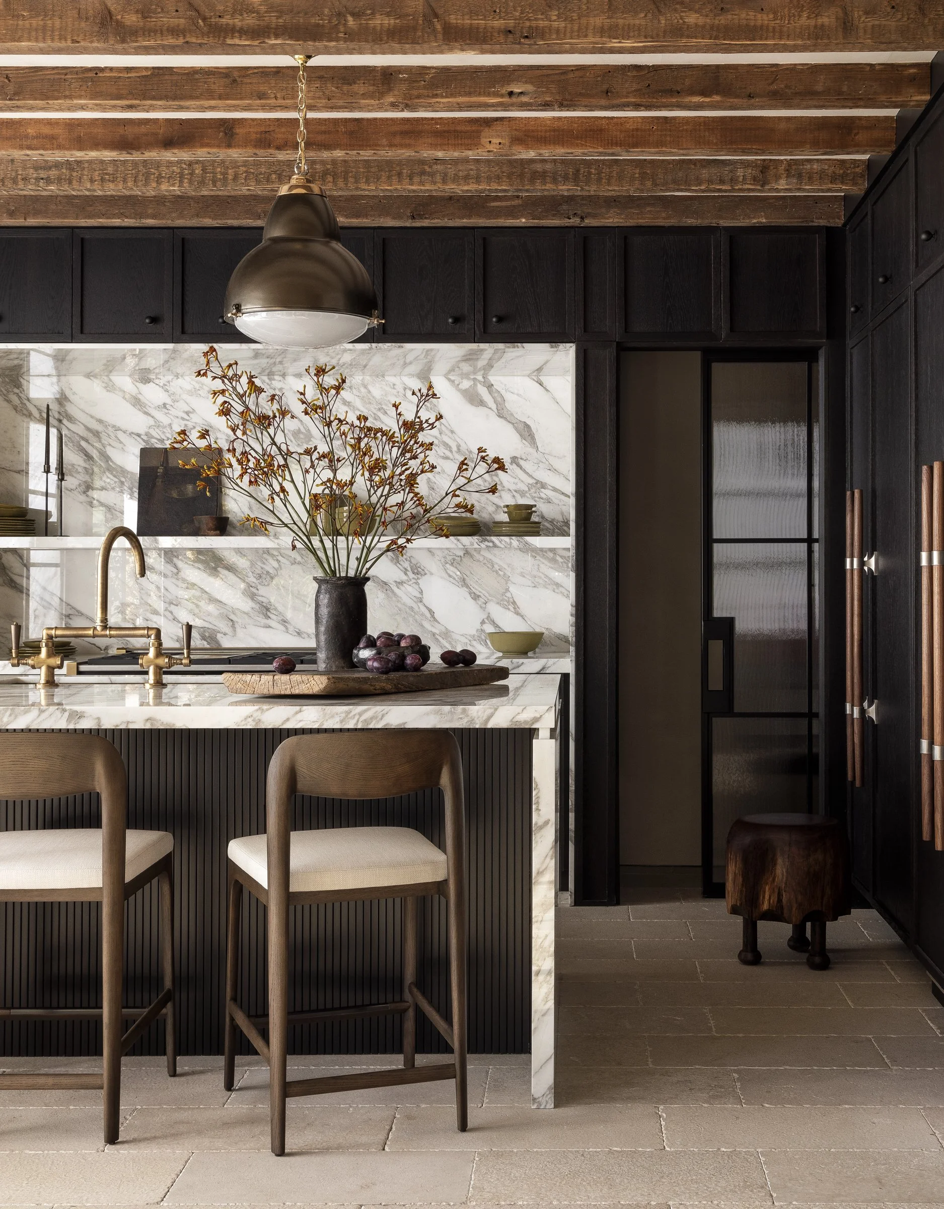
First, Abel reoriented the kitchen and main living area, a process that converted a labyrinthine series of formal rooms into two open spaces with a relaxed, organic flow. Next, Abel and Anderson hatched a plan to play on two primary materials for the interior palette: stone and wood. Abel knew she wanted marble casing on two central doorways, as well as faux wood beams in the kitchen, while it was Anderson’s idea to introduce European limestone for the flooring in the kitchen and foyer. “There’s an irregularity to them because they are reclaimed and, with the tumbled edge, it gives a feeling of age,” he shares.
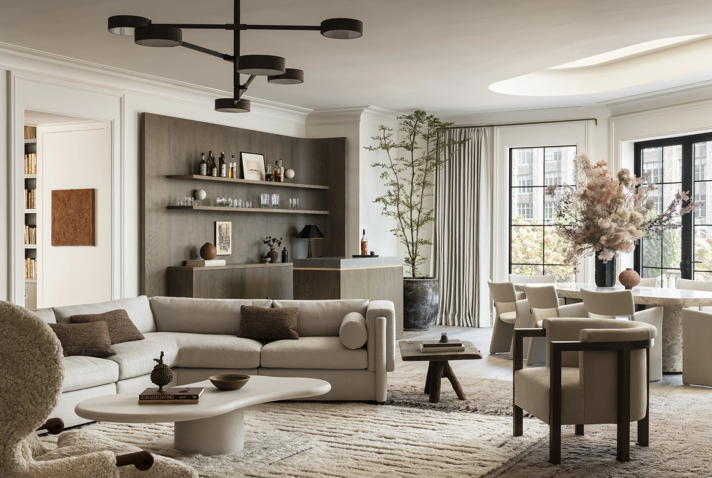
The light color and sandy texture of the pavers play off the roughness of the ceiling beams and the dark-toned cabinetry in the kitchen—a sense of juxtaposition that is Anderson’s calling card. "To me, that element of contrast is what feels like home," says the designer, who paired new with old throughout the residence. In the library, antique reclaimed French oak herringbone flooring sets off custom upholstery and millwork, while the main living area is a mélange of contemporary and vintage pieces. “There’s a storied quality to the mix, and it helps tell the tale of this family and this place,” he notes.
Filling the home with the work of local artisans was also paramount to the designer. “Ilona Golovina is a Brooklyn-based ceramicist that I discovered over the course of this project,” says Anderson, who peppered the artist’s vessels and soil paintings in several spaces. “The rough textures and ‘imperfections’ in her work speak to who I am as a designer,” he adds. The wooden stools with animal-like feet prowling through several rooms came from another New York favorite: woodworker Ian Love. Other locals Anderson was happy to source from included Galerie Was, antiques dealer Michael Trapp and painter Alexandra Yan Wong.
The overall result is a cozy, eclectic home where each room feels like a new chapter in the same well-worn storybook. “I’m big on symmetry and balance when you walk into a space,” says Abel. “With Sean, there’s a layering of stories, but it’s all connected.” Anderson quotes similar materials and shapes throughout to make the home feel cohesive, such as the curve of the bar wall in the living area, which is mimicked in the rounded edges of the plaster coffee table and in the marble dining table. To cap off the symmetry, Abel and Anderson reimagined the skylight above the dining area to mimic the shape of the table. “We tried to soften everything to make the space feel more fluid,” says Abel.
Outside, the wraparound terrace completes the back-to-nature assignment the team began with. “We actually had to edit because there were so many plants out there that it began to feel like a jungle,” laughs Anderson. “We created a pocket within the trees for the dining and cooking areas.” A stone table and a set of wooden plank-like chairs now offer the ideal haven for dining alfresco. Taken together, the result is perfect symmetry.


